The data presented on this site is calculated from the analysis of thousands of public flight track files. This data provides average statistics on paraglider performance in varied conditions and across a wide range of pilots. These statistics are only estimations and should not be taken as absolute values. It is also important to remember that the data is processed neutrally: each flight passes through the analysis and processing algorithm without any modification or preference regarding the paraglider, location, or date of the flight.
Comparaglider is a paraglider comparison tool; it is up to the user to draw their own conclusions regarding the data presented here. This is why the tool aims to be as complete and transparent as possible regarding the analysis of the data it contains. More than just a tool for comparing one paraglider to another, Comparaglider is also a tool for comparing differences between different classes and generations of paragliders.
Above all, remember that only performance criteria can be compared here. There are many other factors that make a wing a good wing, and you should never form an opinion on a paraglider only based on the data presented here.
How the Flight Analysis Algorithm Works
For each analyzed flight, the algorithm splits the flight data into several different segments, allowing each to be analyzed independently and then retrieve the averages for the various flight data. For each flight, thermal segments, transition segments, accelerated transition segments, and braked transition segments are retrieved. A score is then calculated for each flight based on this data. The score is a number out of 100 that indicates the quality and quantity of the data in a flight. It is based 30% on the transition distance covered and the number of thermals circled during the flight (maximum reached at 20 km of transition and 10 different thermals) and 70% on the diversity of transition vector directions (maximum reached when the pilot flew an equal transition distance on either side of a North-South and East-West axis).
To give a visual example, here is what the analysis of a 116 km FAI triangle by Damien Lacaze in 2025 looks like, obtaining a score of 89/100:
His flight on XContest looks like this:
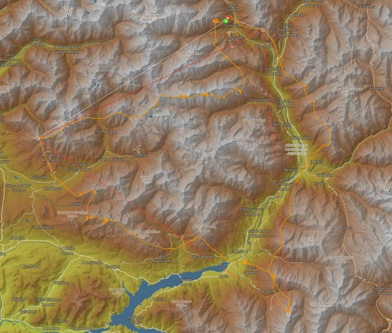
And here is the analysis of this flight by the algorithm:

In yellow are the transition segments, in orange the accelerated segments, in brown the braked segments, and in red the thermal segments.
Transition Segments
Transitions represent the accumulation of each 1 km flight segment without significant turns and with an average sink rate between -0.7 m/s and -2.1 m/s (these arbitrary values are an estimate to include the minimum braked sink rate and maximum accelerated sink rate) to avoid passages in rising or sinking air. The average speed and sink rate are then calculated for these transitions by dividing the total horizontal distance covered and vertical distance lost by the total time spent in transition. Finally, the average speed, sink rate, and glide ratio (which is a ratio between speed and sink rate) in transition for a flight are obtained.
Accelerated Segments
Accelerated segments are retrieved from the 10% of the distance covered fastest in a transition between two thermicals. The sink rate is not taken into account for these segments, only the speed. Then, the method is the same as for the transition segments: the total accelerated distance covered is divided by the total time spent accelerated to obtain the average accelerated speed.
Braked Segments
For the braked segments, the method is the same as for the accelerated segments but taking into account the 10% of the distance covered slowest in a transition between two thermials.
Thermal Segments
Thermal segments are retrieved from parts of the flight where the pilot is climbing and circling. This data is then used to calculate the pilot’s and wing’s thermal efficiency. Thermal efficiency is the percentage of the ratio between the average vertical speed over the entire thermal segment and the maximum vertical speed reached over 5 seconds within that same segment. The thermal efficiency is then accumulated over all the thermal segments of a flight to obtain the average thermal efficiency of the flight.
⚠️ Thermal efficiency is highly dependent on the pilot’s skill level and is therefore an unreliable indicator between two different wings. However, over a large data sample, it can still indicate interesting trends between different wing categories (light, tandem, ultralight, etc.).
Statistical Data Calculation and Weighting
Once the data for each flight has been retrieved and recorded, it must now be weighted to obtain reliable statistical data representative of the wing’s performance across all conditions and all types of pilots.
For each type of data (speed, sink rate, etc.), we will have a dataset per paraglider that groups all the flights for that paraglider. We will weight each dataset on two different axes: the flight score and the number of flights per pilot.
Flight Score
Each flight has obtained a score based on its relevance. It will therefore be given a weight corresponding to this score. The goal is to give less weight to flights that contain little usable data or that take advantage of favorable weather conditions improving the wing’s capabilities (straight-line flights with a tailwind).
Pilot Weight in the Dataset
To prevent pilots with a large number of wings from having too much weight in the statistics, we will slightly rebalance the weight of each pilot by taking a quadratic mean of the number of flights per pilot to obtain the weight of each. There is also a threshold of 40% of the total pilot weight that a pilot cannot exceed to prevent one pilot from representing a majority of a dataset on their own (this threshold is present just in case but is almost never reached). Some examples of pilot weight redistribution in a dataset:
Example with a dataset with no pilot above 40% of the total flight weight:
- Pilot 1: 36.8% of flights, 23.3% of weight
- Pilot 2: 1.1% of flights, 3.9% of weight
- Pilot 3: 12.6% of flights, 13.7% of weight
- Pilot 4: 17.9% of flights, 16.3% of weight
- Pilot 5: 9.5% of flights, 11.8% of weight
- Pilot 6: 6.3% of flights, 9.7% of weight
- Pilot 7: 5.3% of flights, 8.8% of weight
- Pilot 8: 10.5% of flights, 12.5% of weight
Example with a dataset with one pilot above 40% of the total flight weight:
- Pilot 1: 22.5% of flights, 25.6% of weight
- Pilot 2: 63.7% of flights, 40.0% of weight
- Pilot 3: 3.9% of flights, 10.7% of weight
- Pilot 4: 3.9% of flights, 10.7% of weight
- Pilot 5: 5.9% of flights, 13% of weight
Calculation of Weighted Averages
Weighted averages are calculated for the average speed, average sink rate, average glide ratio, and average thermal efficiency. The accelerated speed and braked speed are retrieved at distinct percentiles of the dataset, the functioning of which will be explained later.
For each dataset, we will first remove the extreme values (values beyond two standard deviations from the mean). Then, we will calculate the weighted average of the data type for each pilot.
Once the average per pilot is calculated, we will calculate the weighted average of all pilots based on each one’s weight to obtain the average of the data type for the paraglider.
Weighted Percentiles Calculation
For the accelerated speed and braked speed, we will use a slightly different method. We directly give a weight to each wing that corresponds to its score and the weight of its pilot. The flights are then sorted relative to each other based on the targeted data type (accelerated or braked speed). We will take the targeted percentile of the total flight weight and then traverse the sorted flights in order, adding up their weights until the weight of the targeted percentile is reached. The data type value of the flight that reaches this percentile will be the percentile value for the paraglider.
For the accelerated speed, we are not looking to obtain the average accelerated speed but rather the maximum accelerated speed. We have therefore targeted the 90th percentile, which should be the closest without taking into account maximum values that might be skewed by advantageous weather conditions. For the braked speed, it is slightly different: the lowest values will often be due to a headwind because we don’t really transition while braking the paraglider. The percentile to find this value will change a lot from one paraglider to another. For now, the 40th percentile gives roughly consistent values on most paragliders and is used for the braked speed. There are risks that this value might be inaccurate as it is very difficult to obtain reliably.
Dataset Analysis
Each paraglider wing joins the site once it has obtained 100 analyzed flights from a minimum of 10 different pilots.
However, a dataset for a wing is always considered “less reliable ” when there are fewer than 300 analyzed flights, from fewer than 20 different pilots, or if the average flight score is below 35. In this case, the wing is indicated as having an less reliable dataset in the application (red border on the wing table and red warning on the wing page).
When comparing two wings, it is interesting to compare their datasets through the number of flights and pilots, the average flight score, and the average pilot score. If one of the wings has a much smaller dataset than the other, it is likely that the comparison is less relevant.